What it means to be responsive
# MobileReadyWebsites
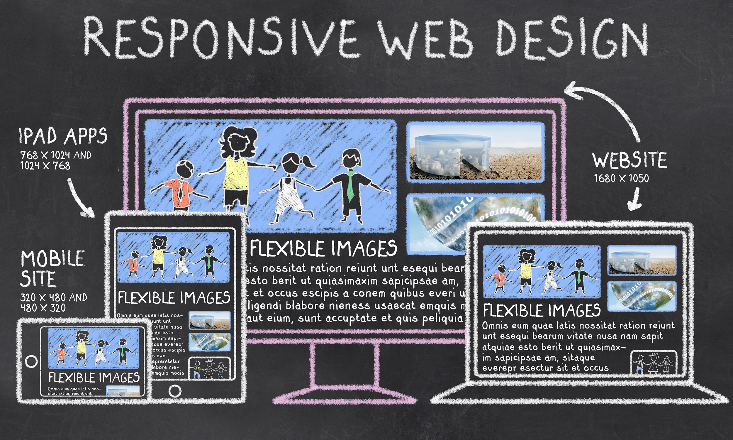
Responsive page design is a way to program a website so that the pages of the site respond — or adapt — to the layout of the device that is displaying the information. This means, if your site is viewed on a desktop computer, the page layout will fill the screen of the monitor. If the same page is viewed on a Smartphone, the elements of the page will resize and restack automatically to accommodate the smaller layout of the handheld or tablet device.
The primary reason to keep your design responsive is to increase the reach of your application to a larger community of users and abide by current web standards.
A website that utilizes responsive design improves the readability of the site's content.
Before the explosion of the use of Smartphone devices, websites were developed to be compatible primarily desktop displays. Nowadays, where more and more users are consuming information on mobile devices, a website needs to handle the changing screen layouts.
Making a page design responsive does not necessarily mean fitting the entire application on the user's screen. It could also mean:
-
Intelligently displaying the amount of information displayed on the page and
-
Making adjustments to the design to improve the users' experience while using the application.
For example, if you open a web application on a desktop, you may consider displaying all of the content composing the site in a three or four grid layout. But, when the layout is displayed on smartphones, the programming of the website should automatically adjust the layout and recompose itself to fit into a smaller grid the layout of the viewer's screen.
Even though mobile screens can now support desktop-like resolutions, the physical dimensions of these devices are still smaller in size.
To make it easier for the user to consume information from the website, steps should be taken to enhance readability — like increasing the font-size when viewed on a smaller screen, increasing the dimensions and placement of thumbnails, etc. — taking these steps to help make the information easier to read and accessible.
It all starts in the initial design phase of the website project.
Planning the responsive development of a site's content at the very onset of a project is key to making sure the final product will not only be adaptable to the device a viewer is using, but also display it in an easy-to-view format.
Taking these steps at the beginning of the project will lead to quicker development of the website and a much cleaner and finished looking product.
If you have questions about how a responsive design can improve the accessibility of your content, please contact us.